Facebag
From a clearance e-shop to a family workshop.
Problem
This is the e-mail we got - with exactly the problem we had to solve.
Facebag, family leather handbag maker
to: Weby Studio
We have sewn bags for thirty years, but the site looks like a clearance sale
Hello,
we have been sewing handbags by hand in Prague since 1991, the whole family, three generations. None of that shows on the website. It looks like any other discount e-shop, people click around and leave, and very few of them buy. We would like the site to feel like our workshop and to be easy to buy from, while staying on Shoptet.
- The site does not feel like a family workshop.
- Visitors leave, only a fraction of them buy.
- We want to stay on Shoptet, not build a new store.
Would you take this on with us? We are happy to pay to finally be seen.
Thanks a lot, Facebag, family leather handbag maker
Solution
Buying first, then the brand
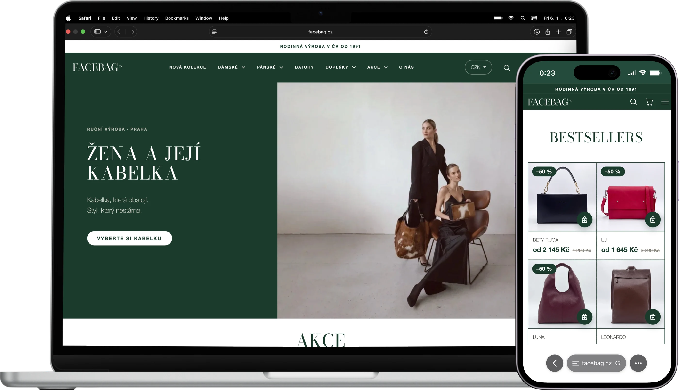
In the first phase we rebuilt the store around buying: clearer product cards, obvious prices and discounts, a shorter path to the cart and a checkout without distractions. The second phase brought the new identity. We dressed the whole site in spruce green with a leather texture, headings got the typeface from the wordmark, and generic sections became timelines, workshop polaroids and bags on a matching background.
Buying
Fewer steps to an order
- Filters above products instead of a sidebar
- Equal-height cards with clear prices
- Green cart with suggested pieces
- Checkout without distractions
E-shop
CoreCore of the solution
- Every page in the new identity
- Home page with a card grid
- Product page with a production timeline
- Mobile tuned separately
Identity
A family workshop, not a sale
- Spruce green and leather texture
- Bodoni from the wordmark in headings
- Timelines of history and production
- Polaroids and leather offcuts from the workshop
Facebagdoesnothavethelowestprices,itsellscraft.SothesitefirsthadtostopgettinginthewayofbuyingandthenstarttellingwhyabagfromHolešoviceisworthit.WedidbothinsideShoptetwithourownCSSandscript,sotheclientstillmanagesproducts,ordersandstockexactlyasbefore.
Change
Product page and the open cart. Same bag, same price and the same platform, everything around them is different.
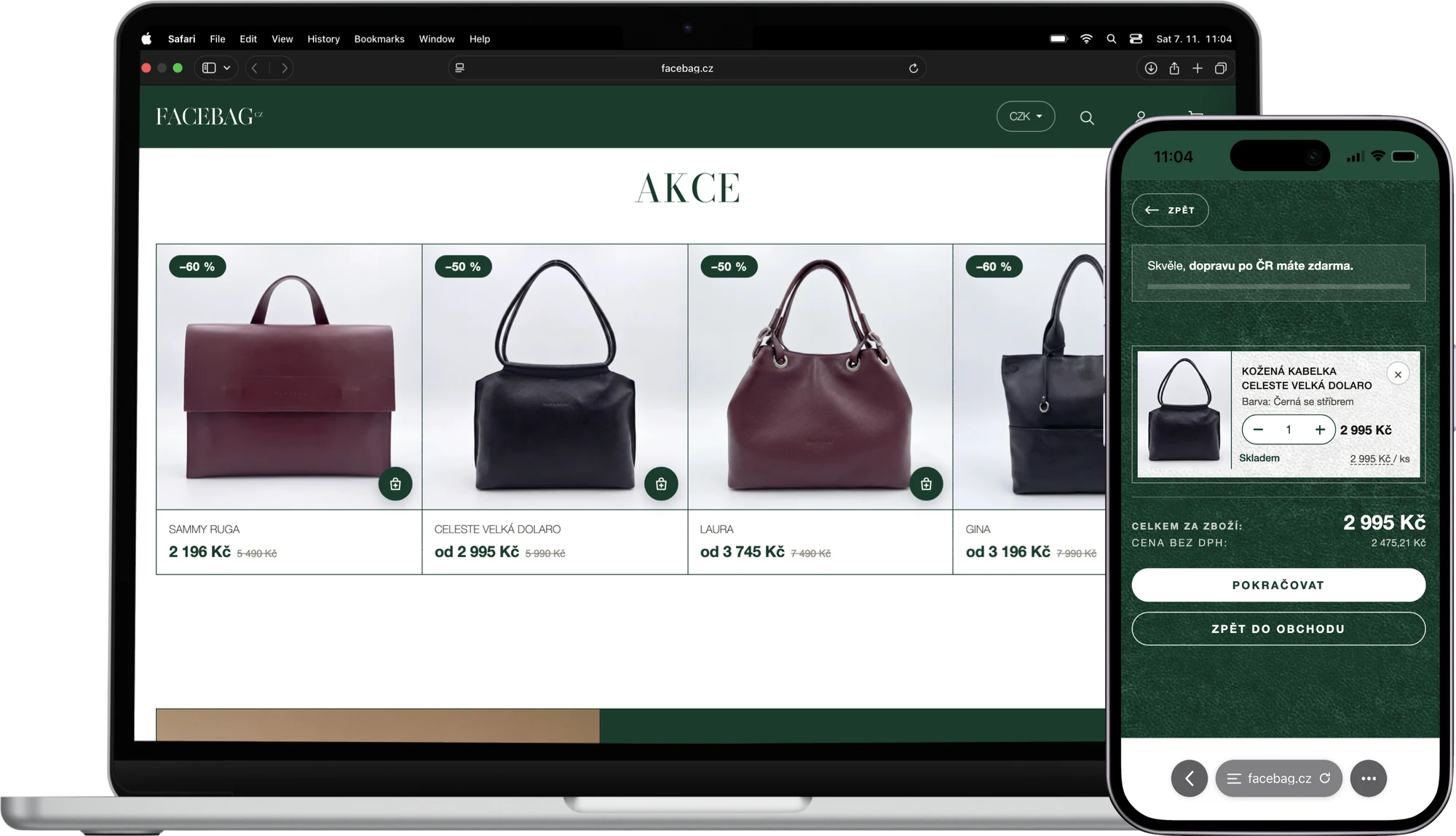
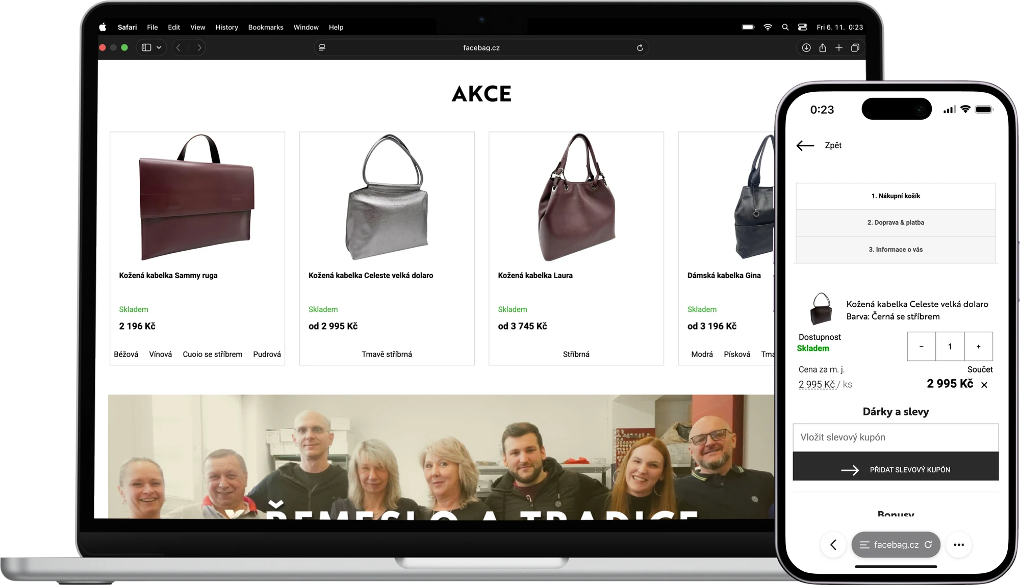
Drag the slider to compare the old and the new site.
Numbers
The conversion rate went up roughly 3.5×
Already after the first phase, which focused on buying, a much larger share of visitors places an order. The new identity has been live since November 2026 and we will add its results.
Figures are rounded and come from the client's own measurement.
Services
Click an app to see what we built in it.
E-shop
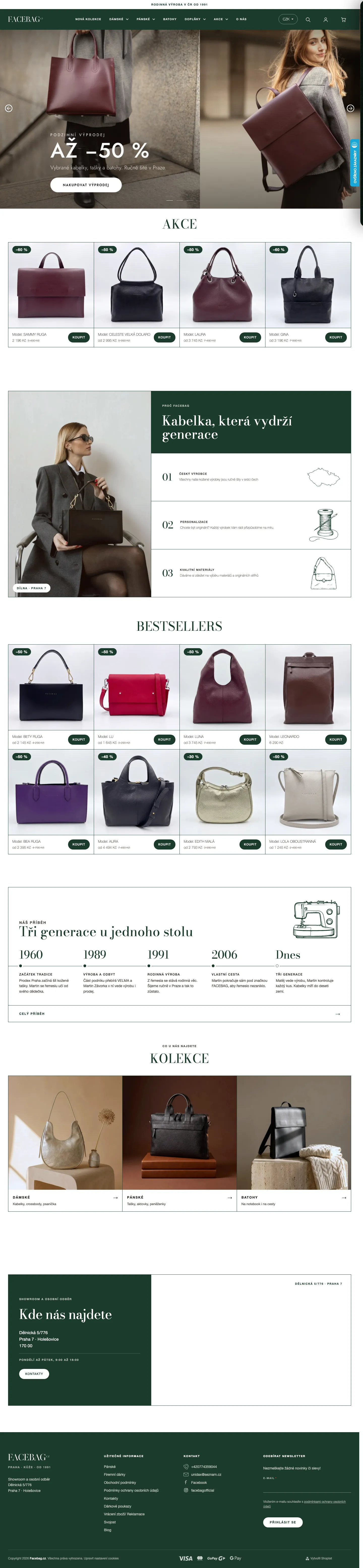
Shoptet dressed in the new identity, from the home page to checkout.
- Categories with a filter bar above products and equal-height cards.
- Product page with a production timeline and reviews on green leather.
- Cart, search and sign-in in green leather with suggested products.
Process
Where we started, step by step.
Process
Weby Studio · 4 phases
Now playing- #Phase